COVID Twitter Analytics
COVID-19: Datasets and Tasks
Twitter Datasets
Part 1: Multi-Lingual Dataset
We started gathering tweets regarding Covid-19 in England on February 28, when the confirmed cases in the UK were only 15, and we continue gathering until now. We started from England because english is the easiest language to extract knowledge from.
We used the Twitter REST API for the most popular tweets, and have gathered up to now 115,776 unique tweets and 18,808,510 retweets of these tweets. The query we use to collect the tweets is: (CoronaVirus AND England) OR (CoronaVirus AND UK) OR (COVID AND England) OR (COVID AND UK) OR #CoronaVirusEngland OR #EnglandCoronaVirus OR #CoronaVirusEn OR #CoronaVirusUK.
About a week later, we started gathering respective data for France, Italy, and Spain and more recently for Germany and Greece. The number of tweets and retweets that we have collected for each country so far is illustrated in the following Table:
| Country | Tweets | Retweets | |
|---|---|---|---|
| France | 21.705 | 6.212.469 | |
| Italy | 29.361 | 8.415.416 | |
| United Kingdom | 115.776 | 18.808.510 | |
| Spain | 17.871 | 16.396.296 | |
| Germany | 2.147 | 9.922.565 | |
| Greece | 1.136 | 5.633.144 |
These tweets do not include only country-specific languages, e.g., french for france, as we have also gathered international tweets that may refer to the spread of COVID-19 in France. Hence each set of tweets is multilingual.
1. Analyzing Tweet/Retweet/Favorites Rate
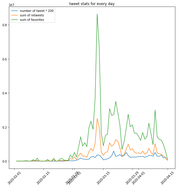
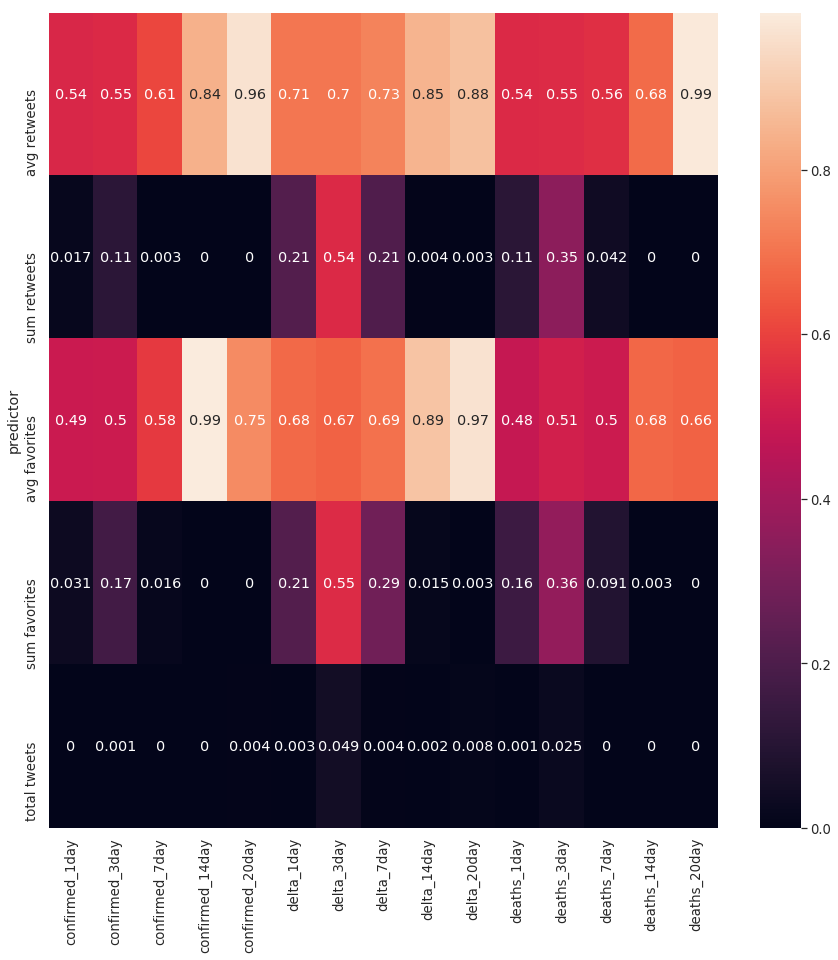
We first study the tweeting activity patterns of the users with regards to the pandemic. The left Figure below shows the number of tweets, retweets and favorites as a function of time. Clearly, users became more active from March 2020. A very large number of retweets was posted between March 10 and March 13. The right Figure shows the p-value derived by computing granger causality between the time series of the left Figure and the time series that emerge from three actual pandemic metrics, namely the number of confirmed cases, the daily increase/decrease in the number of confirmed cases (delta), and the number of deaths. The results indicate a strong relationship between the number of tweets produced (last row of heatmap) and the pandemic metrics.
|
 |
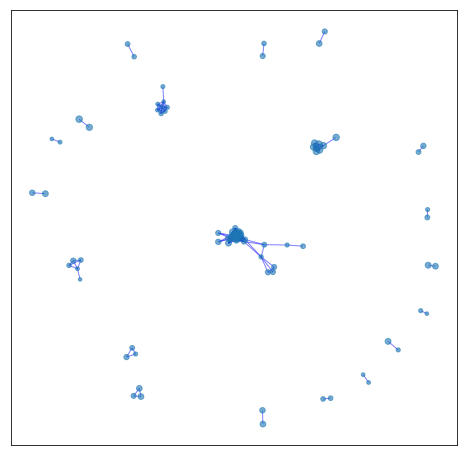
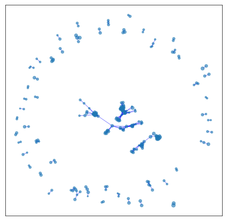
2. Graph-based Identification of Clusters of Tweets
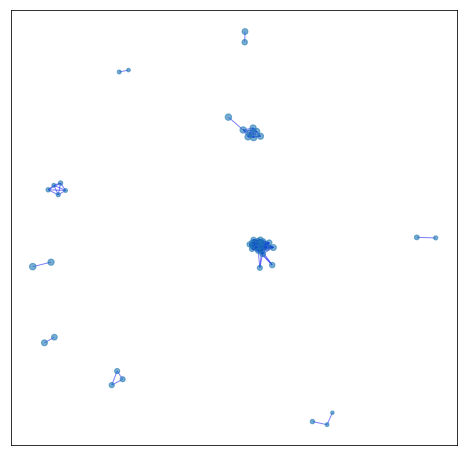
Given our set of unique tweets, we create a graph where nodes correspond to tweets and two nodes are connected to each other by an edge if the two tweets were both retweeted by at least a common user. Therefore, the graph does not model the textual similarity of the tweets. The increase in density of the emerging graph over time indicates how twitter activity increased and how information started to spread as the pandemic unfolds. The following six Figures show the cumulative graph of tweets of the UK dataset up to a certain date (i.e., March 3). As we can see, in all cases, the graph consists of several components which correspond to different topics and different opinions expressed by the users.
|
|
|
| February 17 | February 22 | February 29 |
|

|
|
| March 1 | March 2 | March 3 |
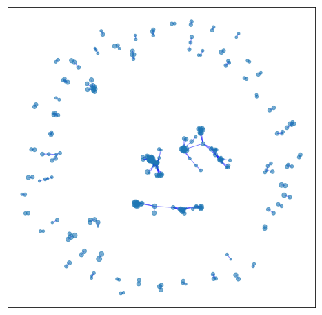
For example, a more detailed view of the third graph (i.e., February 29) is given in the Figure shown below. As we can see, some of the biggest components of the graph correspond to tweets of a single user (i.e., @BBC). We also illustrate the most frequent terms of the tweets posted by these users. Interestingly, some of the tweets contain news posted by official organizations (such as BBC and DHSC of the UK government), while others correspond to personal opinions about the origin of the virus and the policies around COVID-19.
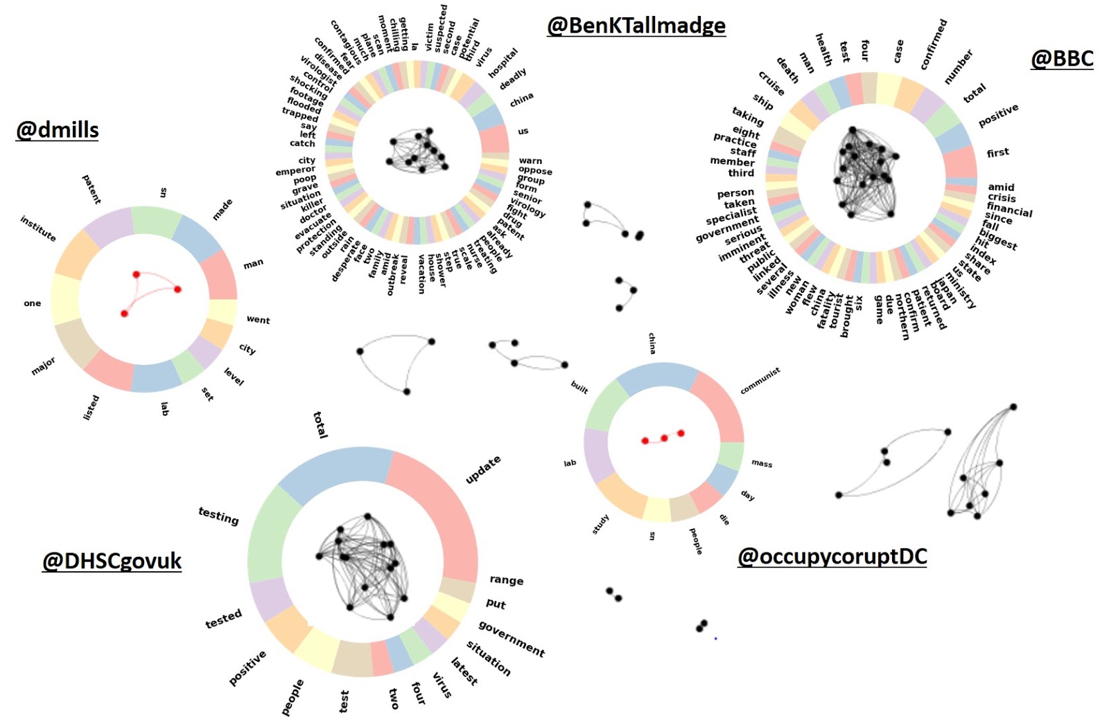
Individual components and their most frequent words on February 29
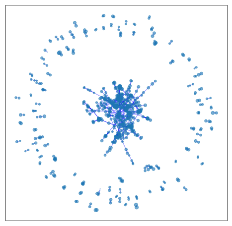
After the 1st of March, however, COVID-19 has become a very central issue on Twitter (as shown also in Figure 1) and hence the relevant tweets’ spread increases. This translates into many users following or resharing a diverse set of opinions/news coming from different sources. Thus, a giant component is now formed, where the most popular opinions are gravitated in. Still, there are numerous individual components around it, but they mostly represent tweets of a certain person about an issue that is not (at least yet) of wide concern.
In order to discern any type of opinion groups inside the main component, we extracted it and applied a community detection algorithm based on weighted modularity. We next computed the word cloud of the most frequent hashtags utilized in the tweets of each community. The word cloud is shown below.
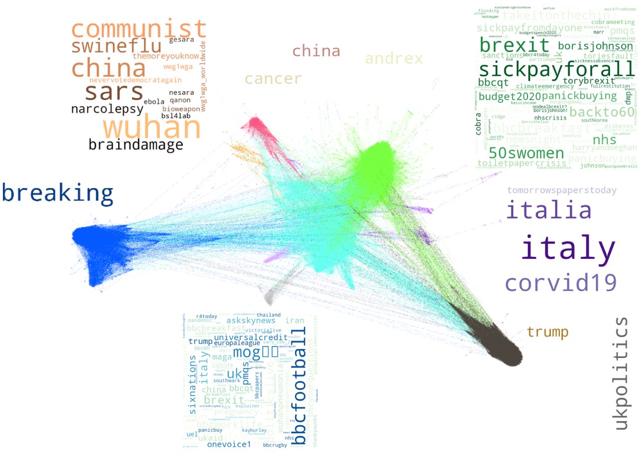
Communities of the tweet graph on March 10th and their most frequent hashtags
One can see that modularity separated successfully some opinion clusters hidden within the graph. More specifically, the blue cluster consisted mostly of official news sources, where the frequent hashtags included “breaking”, ”covid-19”, “coronovirus” etc. These posts are mainly retweeted by neutral users following the news. The purple cluster concerns news around the spread of the virus in Italy, which at that time, was one of the most important subjects since Italy was severely hit by the virus. The green cluster is mainly about the policies of Britain against COVID-19, including the demands for sick pay, the complains about panic buying, the concerns around the NHS, and the Cabinet Office Briefing Rooms (COBRA) meetings that were taking place by the UK officials to plan the UK policies against the pandemic. The cyan cluster contains diverse information from multiple perspectives, that is why its position is central in the graph, and is thus shared by many communities. The most interesting community is probably the orange one (upper left), where we see lots of references to china, and opinions related to conspiracy theories (e.g., #themoreyouknow) that have been adopted by a significant portion of the public since then. More specifically, we find tweets mentioning that the virus was developed in the bsl4 lab in Wuhan, as a bioweapon. Moreover, some tweets share content that is popular amongst the right wing US population, such as political commentary (“#communist #china”), reference to the National Economic Security and Recovery Act (#nesara https://en.wikipedia.org/wiki/NESARA) and support to the conservative party (e.g. #nevervotedemocratagain).
3. Evolution of Hashtags
We next identify which are the most popular hashtags among Twitter users and how these hashtags evolve over time. Specifically, we generate an evolving word cloud which shows the most frequent hashtags for each day from March 2020 to April 2020. The size of a hashtag in the word cloud indicates its popularity. The results for the datasets related to the UK and France are shown in the following two Figures.
 |
 |
We can see that we can get a general idea about the major events related to COVID-19 just by looking at these hashtags. At the early stages of the pandemic, the uncertainty due to the virus caused people worry and stress, therefore hashtags such as #coronavirusoutbreak, #panickbuying and #toiletpapercrisis became very popular. Then, on March 12th, when the COBRA meeting took place, the top trend became #cobrameeting, followed by #herdimmunity on March 16th, shortly after the UK government announced that they will rely on herd immunity to slow the spread of COVID-19. The hashtags #lockdownuk and #londonlockdown took over on March 19th, the day the lockdown decision was announced. Other major events include #borisjohnson on March 27th, the day Boris Johnson was tested positive and #queensspeech on April 5th, the day the Queen gave the coronavirus speech. We also see that as time evolves, people start to calm down, leading to more positive tweets. Starting from April, positive hashtags such as #wearetogether, #outsmartepidemics, #clapforcarers, #protectthefrontline have become increasingly popular.
4. Evolution of Vocabulary
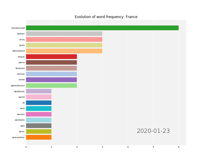
Besides hashtags, we also study how the vocabulary of the tweets evolves as a function of time. Specifically, the following two charts illustrate the 20 terms with the highest cumulative frequencies over time in the UK and France datasets.
 |
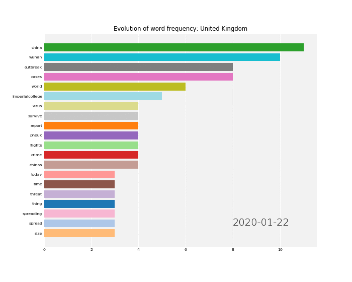 |
Again, it is clear that the most frequent terms are related to the major subevents of the pandemic. For instance, we can see that the term “macron” appears in the list of the most frequent terms on March 12th, the day when the French President Emmanuel Macron announced a series of measures to slow the spread of COVID-19. On March 15th, the term “confinement” became one of the most frequent terms. The next day, President Macron announced a 15-day lockdown. Similar trends are observed in the chart generated by the tweets of the UK dataset.
Part 2: Real-time Twitter Dataset
In parallel, we started collecting a more broad category of tweets using the Twitter Streaming API. In this case, our filters are focused on tweets that include the hashtags “covid19” and “coronavirus”. The objective of this dataset is to collect a huge, coherent, body of texts related to the virus and use it for further research tasks such as training word embeddings. Up to this point, we have collected over 160m tweets, averaging 3m tweets per day.
Facebook mobility data
Impact of COVID-19 on Population Mobility
To study how population mobility varied across regions and within each region during the pandemic, we utilized a dataset released by Facebook in the context of the Data For Good program. The data is collected directly from mobile phones of users over 18 years of age that have the Facebook application installed, and the Location History setting enabled. In the case of France, each region corresponds to a department (overseas departments are not included). The raw data contains three recordings per day (i.e., midnight, morning and afternoon), indicating the number of people moving from one department to another at that point of day. We compute a single value for each day and each pair of departments by computing the sum of the three values.
In our study, we assume that the mobility patterns contained in the dataset are correlated with those of the whole population. In fact, ideally, we would like the former to be proportional to the latter (we would like this to hold for some c < 1, mfb=cm where mfb is the amount of mobility contained in our dataset and m is the actual amount of mobility for the same period).
To explore our data, we have created plots for the different departments and an aggregated plot for the whole of France. These plots have revealed some interesting findings. For example, in most cases, we observe that lockdowns have a significant impact on population mobility between departments. This can be seen in the following Figure which illustrates the mobility within departments and across departments in France as well as the number of reported cases with respect to time.
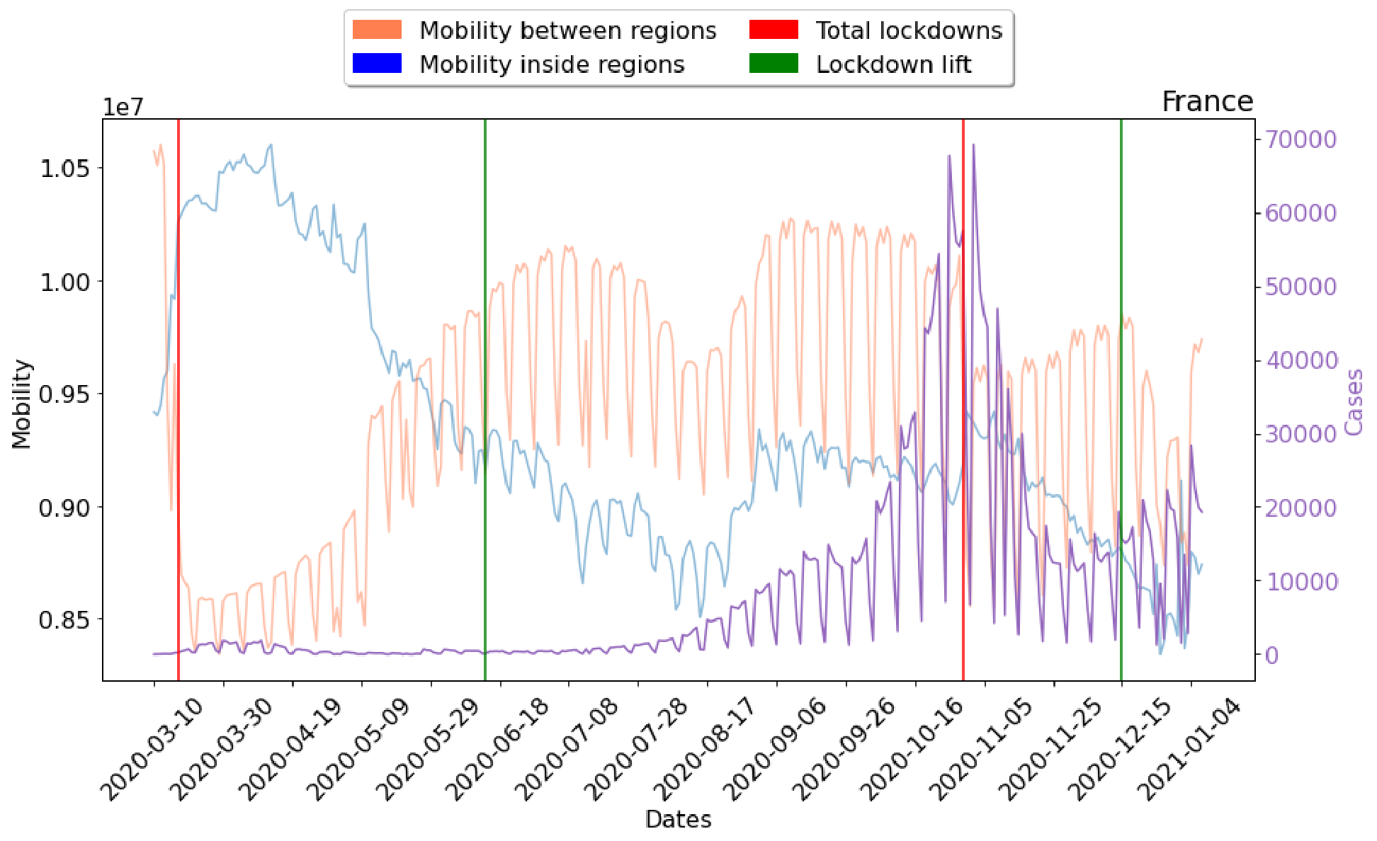
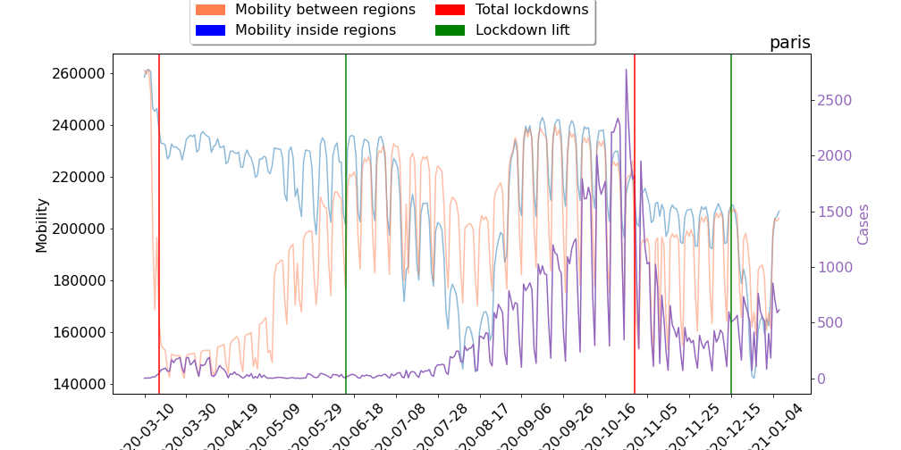
The red and green vertical lines indicate the start and end of the two lockdowns that were imposed by the French government. For instance, it can be seen that there was a 20% decrease in population mobility between departments when the first lockdown was introduced. In some regions, such as in Paris shown in the Figure below, mobility from and towards other departments was decreased even further due to the imposed restrictions. In the case of Paris, we observe a decrease greater than 40%.
Another interesting finding is that beginning from August 2020, the number of confirmed cases seems to be very correlated with population mobility. From August 2020, both mobility between departments and mobility within departments gradually increase and we notice a similar increase in the number of confirmed cases. At the end of October 2020, new restrictions are imposed by the government which leads to a decrease in population mobility and also in the number of cases.
The second lockdown that was imposed by the government seems to be less strict than the first one since the decrease in mobility between departments is not that large as in the case of the first lockdown.
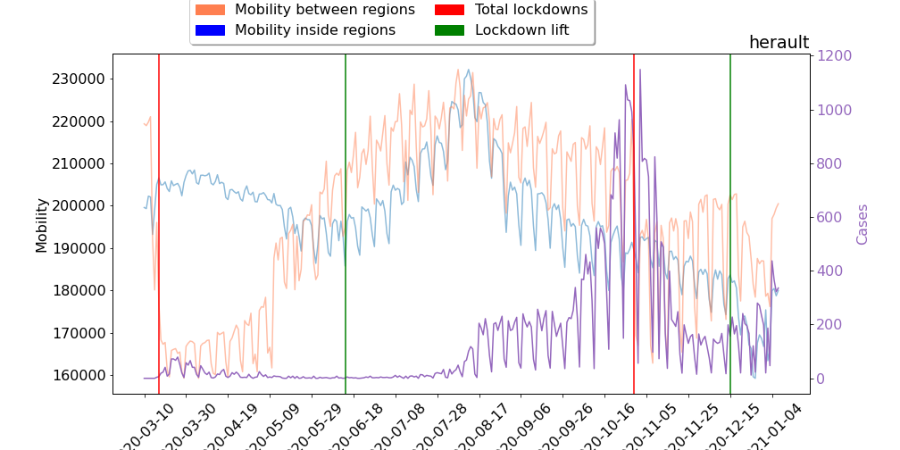
With regards to the mobility within departments, we observe that it achieves its minimum values in mid-August 2020 and also at the end of December 2020 and the first days of January 2021. Both these time intervals correspond to periods where people usually are on holiday (summer and Christmas vacation). Thus, the decrease in mobility could be due to the fact that they did not go to work. Interestingly, this pattern is not ubiquitous in all departments. For instance, the following Figure shows the mobility patterns extracted for the Hérault department. Herault is bordered to the south by the Mediterranean sea, and is a very popular tourist destination. Montpellier is the major city of this department. We can see that in mid-August, both types of mobility take very large values, the largest within our time-span of interest.
On the other hand, the Isère department contains more mountainous areas and it also includes a part of the French Alps. Thus, as we can see in the following Figure, in the summer the mobility within that region decreased a lot.
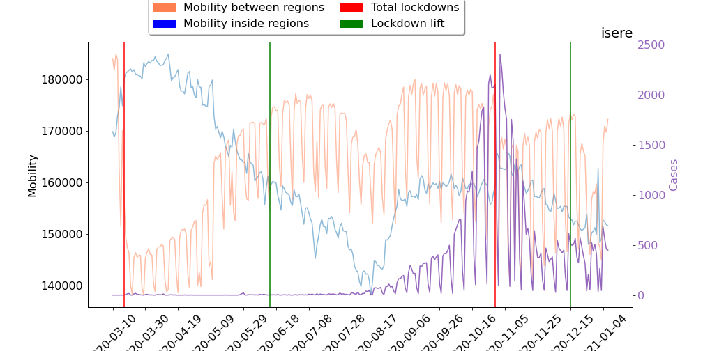
It is thus clear that many people decided to travel or go on holiday even though the pandemic had severely affected France at that point. The effects of summer vacation on disease spread are quite obvious since from the end of the summer, the number of confirmed cases increased significantly. Furthermore, we can see that the lockdown imposed in October 2020 was quite effective. Specifically, the number of confirmed cases was decreased a lot a fews weeks after the lockdown was announced by the government.
With regards to the recovery of population mobility, we observe that mobility between regions starts to recover some weeks after the first lockdown was initiated even if the lockdown had not been lifted yet. In the first weeks of the summer, mobility between departments had almost reached its pre-covid levels. On the other hand, mobility within departments kept decreasing till the end of the summer and then started increasing, but never reached its initial levels.
Predictive Modelling with Graph Neural Networks
We created a model for predicting the number of COVID-19 cases up to 14 days ahead in small regions of European countries during the first wave of the pandemic, using the past number of cases in the region and the mass mobility between regions.
Paper: https://arxiv.org/pdf/2009.08388.pdf
Code & Data: https://github.com/geopanag/pandemic_tgnn
We focus on the 4 EU countries that were hit hard by the pandemic. We gathered the time series of daily COVID-19 cases in regional level from open sources such as github or government websites and (noted in the github page of the project). Each country is broken to NUTS3 regions and some are removed due to infeasible values or failure to connect with the mobility dataset described below.
| Country | Starting Date | Regions | |
|---|---|---|---|
| France | 14/2 | 105 | |
| Italy | 10/3 | 81 | |
| Spain | 12/3 | 129 | |
| United Kingdom | 13/3 | 35 |
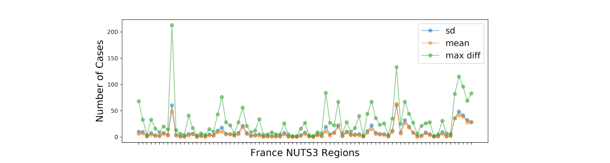
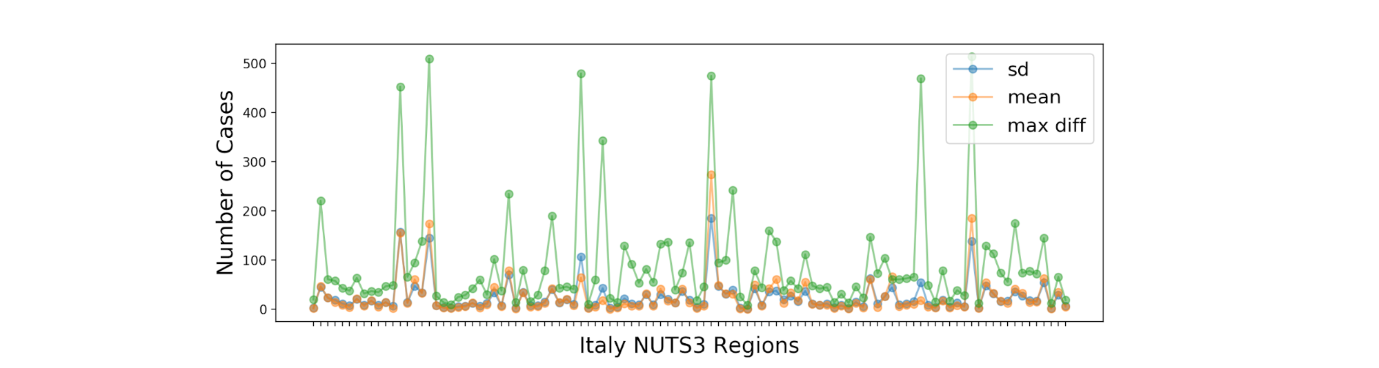
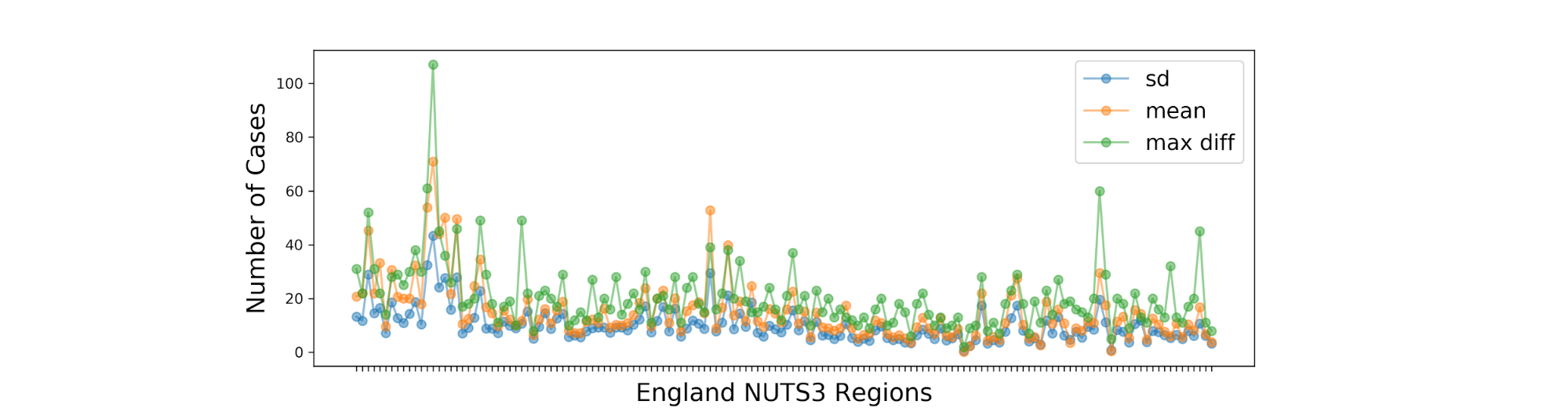
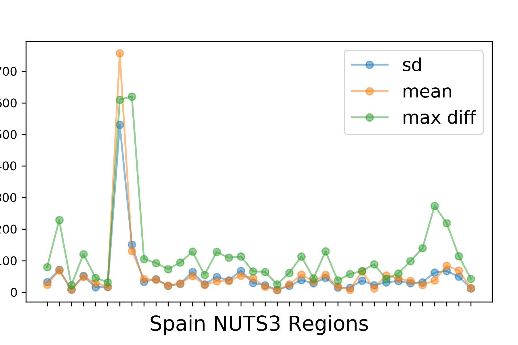
To evaluate the difficulty of the task, we first view the summary statistics of the regions’ time series, which shows that standard deviation is almost as large as the mean and the maximum subsequent difference is multiple time bigger, hence most time series include some very big spikes:
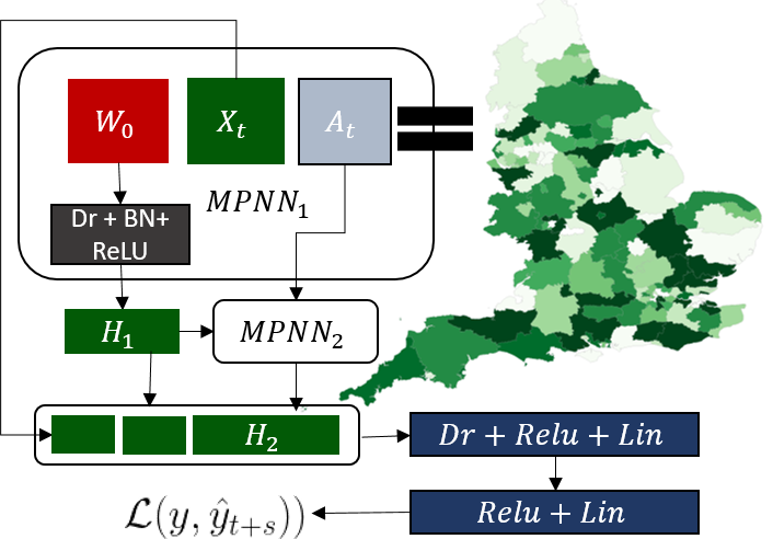
From the above, and based on our knowledge of COVID-19, it would be hard to predict the future of the time series solely based on its past. Hence we decided to utilize the mass mobility between and inside regions, as a potential predictor. The mobility data is collected as part of the Facebook Data For Good(https://dataforgood.fb.com/docs/covid19/) initiative and it is computed from mobile phones that have the Facebook application installed and Location History setting enabled. The mobility data can be formed into temporal graphs where the nodes are the regions and the weighted edges are daily movement between them. The mobility and recent number of cases in a region are then combined through a 2-layer Message Passing Neural Network (or Graph NN) to derive the predictions, as shown in the figure below:
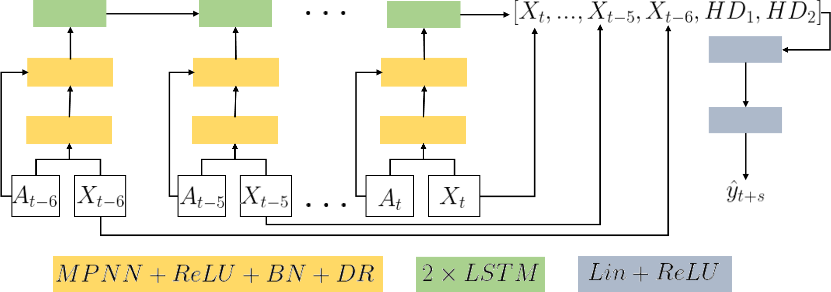
To capitalize on the temporal correlations between subsequent mobility and cases, we further improved our model using a combination of the above architecture with LSTMs:
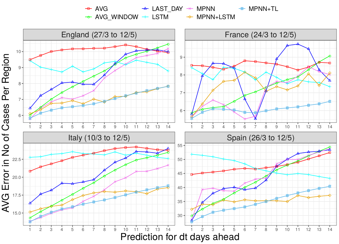
Finally, we develop a transfer learning algorithm based on model agnostic meta learning such that the models predicting the pandemic spread in a country can leverage knowledge from other countries infected earlier. The error for all predictions (from next day to 14 days ahead), along with other benchmarks are shown below:
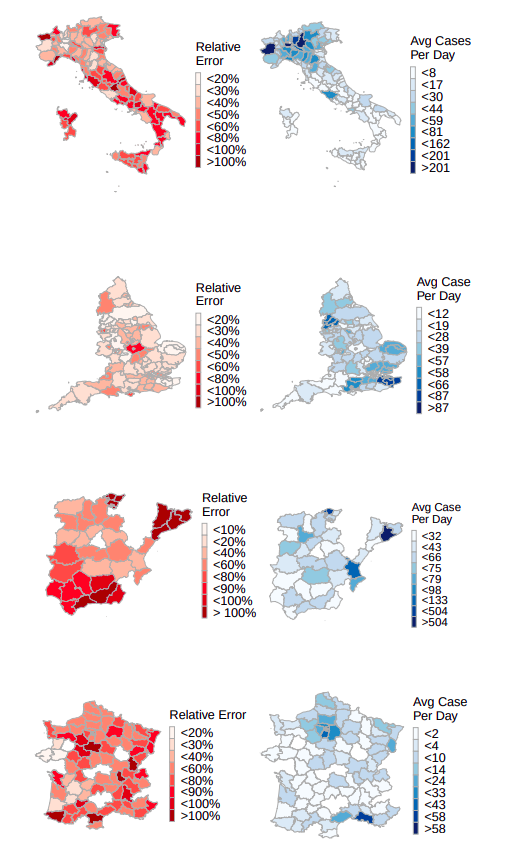
To account for the different populations and the abnormal distribution of cases throughout different regions, we create map plots with the average error of short term predictions (5 days) relative to the absolute value of the ground truth. We juxtapose this percentage with the actual number of cases to verify that regions with high numbers of cases have small relative error, and vise versa for regions with small numbers of cases.